Brand Identity
Teruko Jewelry
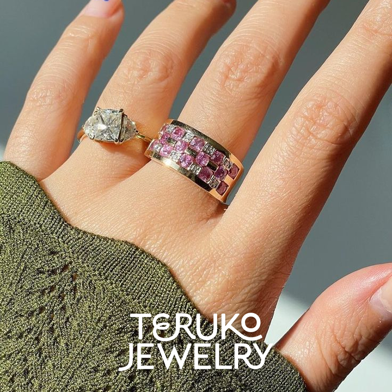
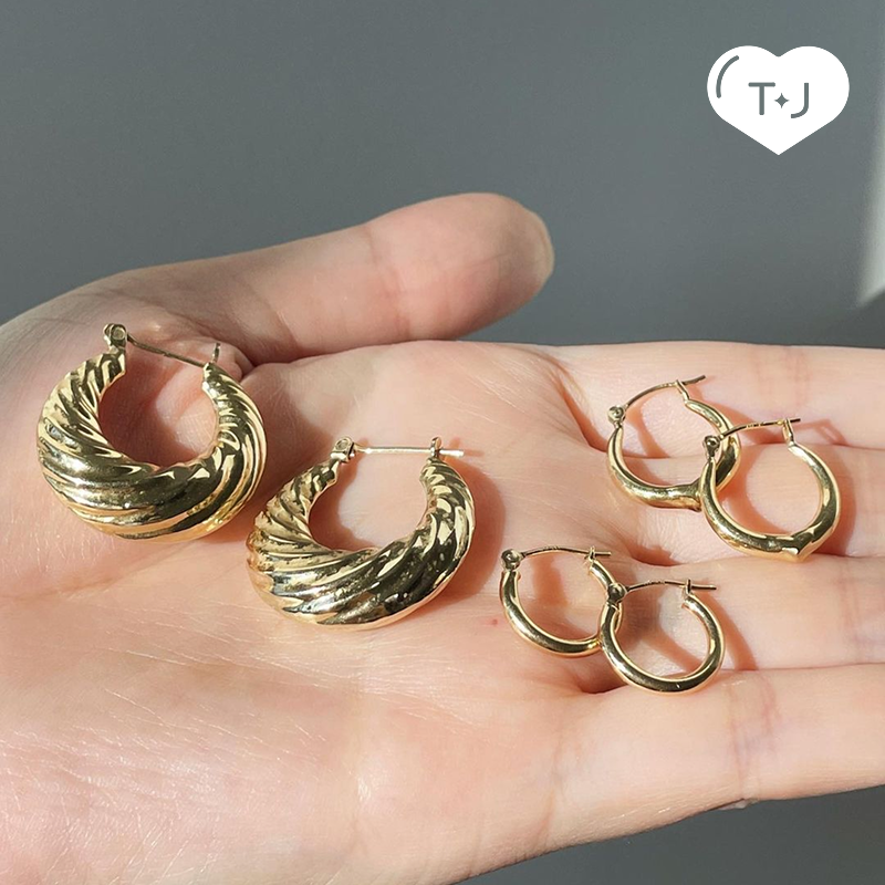
Teruko Jewelry is a curated fine jewelry brand that celebrates vintage, new, and pre-loved pieces for jewelry lovers. The brand is built on a sense of community, connection, and joy, bringing together timeless craftsmanship with playful, approachable design.
The identity reflects this ethos through a balance of femininity and charm, incorporating expressive details alongside clean, modern structure. Every element, from the logo to typography and color palette, is designed to feel distinct yet inviting, reflecting the personality and vision of Emily, the creative force behind Teruko, and the heart of the brand.
Logo Lockup
The Teruko Jewelry logo features friendly, rounded type with playful, flowing ligatures that reflect community and connection. A custom swirly ‘E’ represents Emily, the founder, whose distinctive taste shapes the brand. The symbol honors Teruko Jewelry’s heritage with a star from previous branding and a heart highlighting the brand’s hero product.
Wordmark & Symbol
Typography
The primary typeface, Glorich, brings personality and elegance to the brand with flowing ligatures, perfect for headlines and key moments. Poppins, a round and friendly sans serif complements Glorich for body copy and additional text. Its approachable geometry reinforces the brand’s friendly, welcoming tone while maintaining clarity and readability across applications.
Color Palette
The palette pairs bold, saturated hero colors with soft accent tones inspired by gemstones. This combination balances energy and approachability, reflecting Teruko’s playful and vibrant spirit.
Illustrated Mascots
The Teruko Jewelry mascots personify the brand’s playful, inviting spirit, drawing inspiration from key icons in Emily’s personal collection. Used sparingly, they bring a cheerful presence that embodies the joy, warmth, and camaraderie at the heart of the Teruko community.


