Brand Identity
Good Get Productions
Good Get Productions is a comedy podcasting company built on a playful, clever, and approachable brand identity.
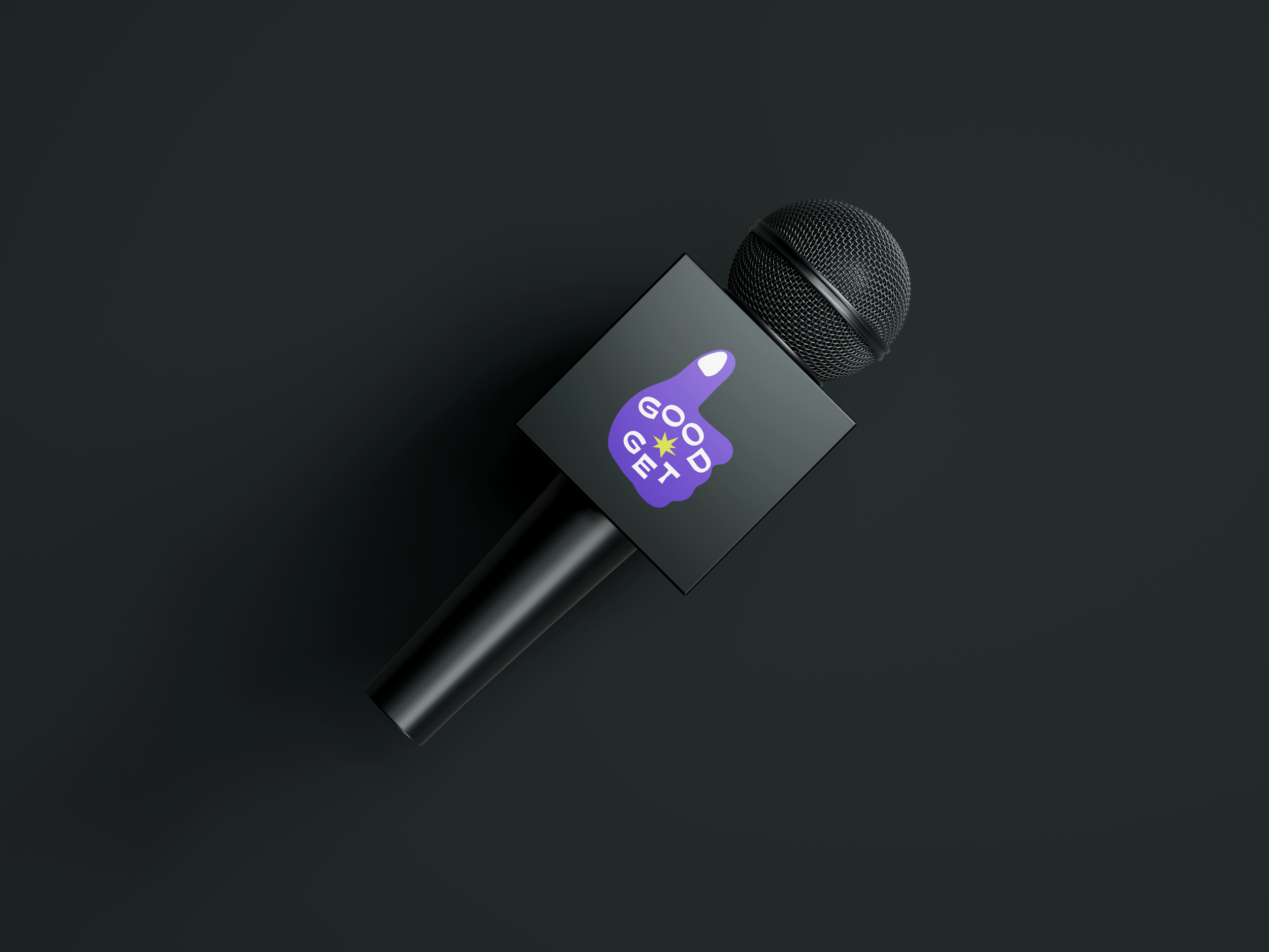
The design direction for their brand launch focused on capturing the humor and heart of Good Get while ensuring the identity could flex across digital, print, and merchandise. The visual system pairs bold, high-contrast type with a vibrant color palette, creating a dynamic brand world that feels as fresh and quick-witted as the content itself.

Wordmark & Secondary Logos
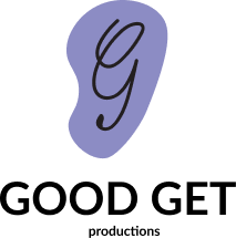
Logo Lockup
The Good Get logo combines a hand-drawn thumb, playful typography, and a bold starburst to reflect the brand’s witty, human energy. Imperfect and expressive, it captures the spontaneous creativity at the heart of the comedy podcast studio.

Typography
Good Get’s typography palette combines two complementary sans-serifs: Futura PT and Moche. Moche adds bold personality and dynamism to headlines, while Futura PT provides a clean, timeless foundation with its versatile geometric shapes.

Color Palette
The color palette is dynamic and speaks to the diversity of podcasting genres. Inspired by the endless stories and voices in the podcasting world, it takes classic shades and amplifies them with vibrant, high-energy tones, each named after unique storytelling moods.
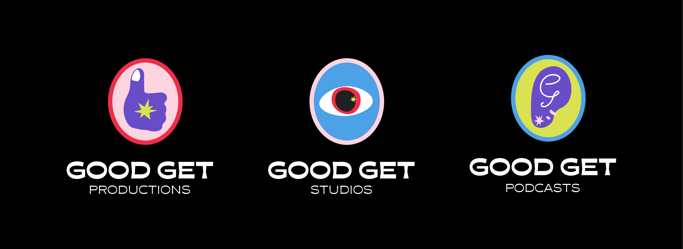
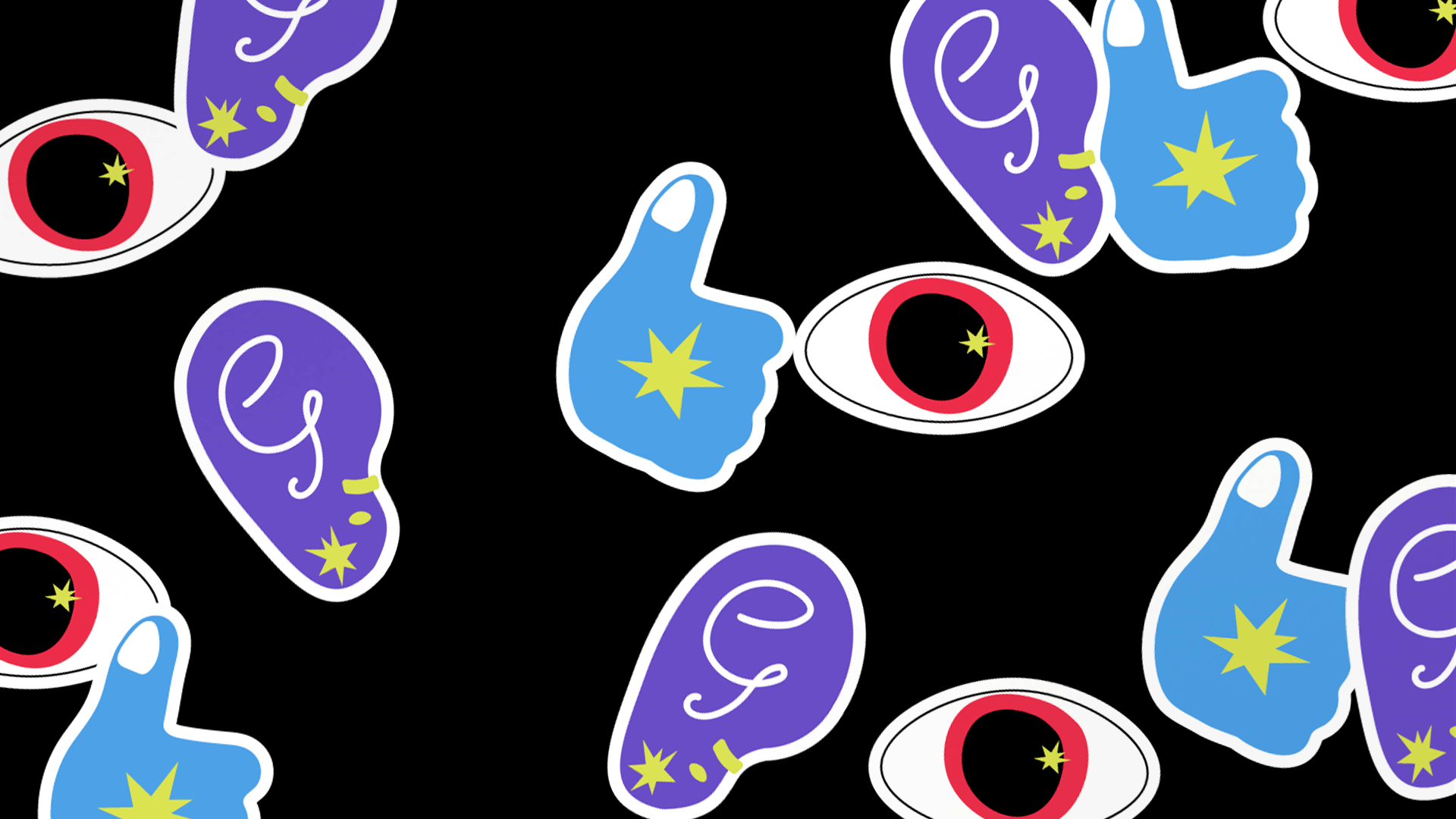
Expanding the Brand System
The expanded Good Get brand system builds on the idea of human connection at the core of the company’s creative work. Each arm of the brand is represented by a different body part—a thumbs up for Productions, an eye for Studios, and an ear for Podcasts—forming a visual metaphor for the senses that drive storytelling and collaboration. Together, these icons create a flexible, system that grows with the brand, capturing its humor and warmth.